An Intro to Walkability in the United States
We explore the factors that have a significant effect on walkability in the United States. As urban planner Jeff Speck once said, “The pedestrian is an extremely fragile species, the canary in the coal mine of urban livability.” Our main argument is that the socioeconomic status of certain groups residing within urban areas, particularly those with lower incomes and those who are unable to afford cars, affects the way that they experience areas with high walkability.
Even though National Walkability Index scores are calculated based on the presence of factors that directly facilitate walkability, the EPA does not consider in this calculation the effects of incentives for individuals to walk on the sidewalks. Such incentives include the commute distance for workers who need cars, worker income, ethnicity, and crime rates, which can dramatically impact how safe one feels in walking. For instance, a study of the socioeconomic factors affecting walkability across 500 US cities showed that as median income increased in ethnic neighborhoods, walkability decreased. However, in the case of Black-majority neighborhoods, lower-income neighborhoods had lower walkability scores (Conderino et al.). This indicates that the general socioeconomic status of a neighborhood does not always correlate with increased walkability, as the uneven distribution of resources across different ethnic groups also plays a role.
In the data set, we noticed that average walkability scores were higher in states with a larger population density. This statistic supports our argument because it reflects how more populated states (and therefore wealthier, since more taxpayer dollars) have higher walkability scores than less populated, poorer states.
To analyze national walkability, we used the EPA Smart Location Database (SLD) made by the U.S. Environmental Protection Agency (EPA). This data set is relevant for our topic because it was specifically designed to take into account key urban planning factors such as diversity and destination accessibility. Furthermore, the data set also has national coverage, allowing us to examine regional disparities.
Socioeconomic Factors in Walkability
Of our annotated bibliography, walkability has numerous positive and negative implications. Firstly, the intersection between race and income drastically shows up in the literature. Many authors argue that BIPOC communities are more likely to live in less walkable neighborhoods, which is a direct result of less investment in the aforementioned communities. For example, in (Conderino et al.), Conderino deeply investigates the social and economic determinants of what makes certain cities and neighborhoods more walkable than others. They compared various socioeconomic factors across 500 different cities and found that, across these cities, walkability generally decreases as the median income increases. However, this is true for neighborhoods of all ethnicities except for Black-majority neighborhoods, where the lower-income neighborhoods were found to have lower walkability scores. Thus, this research study describes an underlying systemic racist layer that is specifically designed to keep poor Black neighborhoods poor.
Another perspective of how socioeconomically disadvantaged communities are commonly forced to live in areas of low walkability is through (Su et al.). In this article, they argue that these communities’ neighborhoods have low walkability not by chance, but due to purposeful urban design. The authors found this by employing a composite Integrated Walkability Index. This index was obtained from 13 different indicators, including but not limited to connectivity, accessibility, safety, and suitability, and analyzed walkability profiles across a multitude of different areas and neighborhoods. They discovered that lower neighborhood walkability is primarily observed in socioeconomically disadvantaged communities, suggesting that significant social inequalities in street walkability exist across these communities.
In addition to research on underprivileged communities living in less walkable areas, we also looked at literature about higher race-based residential segregation at the city level that is associated with differing measures of walkability (Spoer et al.). Through the analysis of data from 745 U.S. cities, using WalkScore as a walkability metric and the Index of Dissimilarity for Black-White and Latino-White segregation, researchers found that there actually was not a straightforward explanation for the observed association between race-based residential segregation and walkability. However, they did find that these urban designs did not promote enough physical activity in some of these segregated neighborhoods, which led to higher prevalence of chronic diseases, such as diabetes. These findings show that the idea of income inequality and neighborhood walkability can also be extended to causes of declining health conditions.
Other Factors of Walkability
Besides racial and income inequalities correlated with walkability, other authors in our literature review have also mentioned walkability being associated with quality of life, crime rates, and environmental factors. Regarding the correlation between quality of life and walkability, there has been research surveying residents from different cities and asking about their quality of life living in those cities. The conclusions found from the research studies showed that residents from denser, greener, and more walkable neighborhoods who participated in the survey expressed higher life satisfaction. Therefore, increased walkability also has a positive effect on quality of life (Pfeiffer et al.).
Another common research topic associated with walkability is how a city’s crime rate affects its walkability. For example, research has found that, across 9 different U.S. cities with varying levels of walkability, increased walkability also increases the prevalence of all types of crimes (Wo and Kim). This shows that despite the positive influence walkability has on quality of life, it also has a negative influence on a city’s crime rate.
Walkability also has correlations with environmental factors, as seen from the literature. From (Marshall et al.), researchers found that lower-income neighborhoods had higher concentrations of Nitrous Oxide (NO), which is a major component of air pollution, and lower concentrations of Ozone (O3). On the contrary, higher income neighborhoods were found to have lower NO, higher concentrations of O3, and higher walkability scores compared to their lower-income counterparts. Thus, this shows that increased walkability and household income decreases amounts of air pollution.
After reviewing this literature, we can confidently say that most of the research has concluded that higher walkability is correlated with higher quality of life. However, higher walkability is also mostly found in higher-income neighborhoods and non-minority communities. Future research can explore how living in a walkable neighborhood directly affects the presence of adverse health conditions, as there is no conclusive evidence of a direct correlation between these.
Data Analysis and Visualizations
To understand how walkability varies across the United States, we first examined which Core-Based Statistical Areas (CBSAs) have the highest National Walkability Index scores. This helps reveal whether walkability is concentrated in particular types of cities..
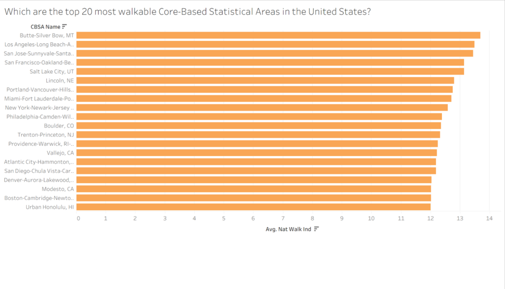
Figure 1 – Average Walkability Index for the Top 20 Most Walkable CBSAs
As shown in Figure 1, the most walkable Core-Based Statistical Areas (CBSAs) in the United States often correlate to larger cities, such as New York, San Francisco, and Los Angeles. This makes sense, as these cities often contain denser infrastructure, extensive public transit systems, and mixed land use, allowing residents to reach their workplaces without relying on car use. Some notable exceptions include Butte, Montana and Lincoln, Nebraska, but, otherwise, the most walkable CBSAs either are larger cities or are near larger cities.
We then tried to find a general trend between walkability index across all CBSAs in the United States, not just the most walkable ones.
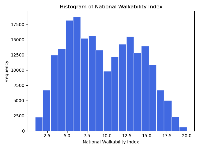
Figure 2 – Histogram of National Walkability Index
Interestingly, Figure 2 shows that the National Walkability Index has a bimodal distribution. This ultimately makes more sense than first meets the eye. Plenty of CBSAs are in rural or semi-rural areas with little access to public transportation or sidewalks, and the nearest grocery store being well past walking distance from most people’s houses. Therefore, these CBSAs correspond to the first peak of the histogram with a relative lack of walkability. Likewise, because CBSAs are dependent on both area and population, it is not shocking to see many CBSAs with a walkability index on the higher end, as these CBSAs likely correspond to those in larger cities. This graph ultimately lines up nicely with the United States population being split between urban and rural areas.
Next, we examined how far people generally live from their workplace, tying back into America’s urbanization. Most people in the United States live in large metropolitan areas, and also try to live as close to their places of employment as possible.
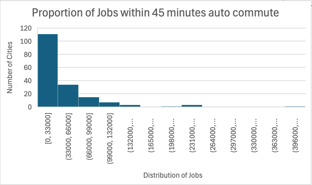
Figure 3 – Proportion of Jobs within a 45 minute car ride
This histogram shows that in over 100 cities, the number of jobs within 45 minutes by car is between 0 and 33,000, showing that most Americans indeed live within a driveable commute from their place of work. Furthermore, this histogram is right-skewed, meaning that there are nowhere near as many jobs outside of 45 minutes of commuting. Ultimately, people in American cities are, on average, likely to live within 0-90 minutes of work. This is important because public transit is meant to serve a large population of people, and if many people have the same constraints to get to work, public transit can be made a more efficient and effective option to get to work. Therefore, public transit can indeed be an option for many Americans to get to work, which will improve the walkability of American cities overall.
Going back to the topic of infrastructure density, we then examined whether residential density has a direct correlation with walkability. Urban planning theory generally assumes that higher density naturally leads to greater walkability.
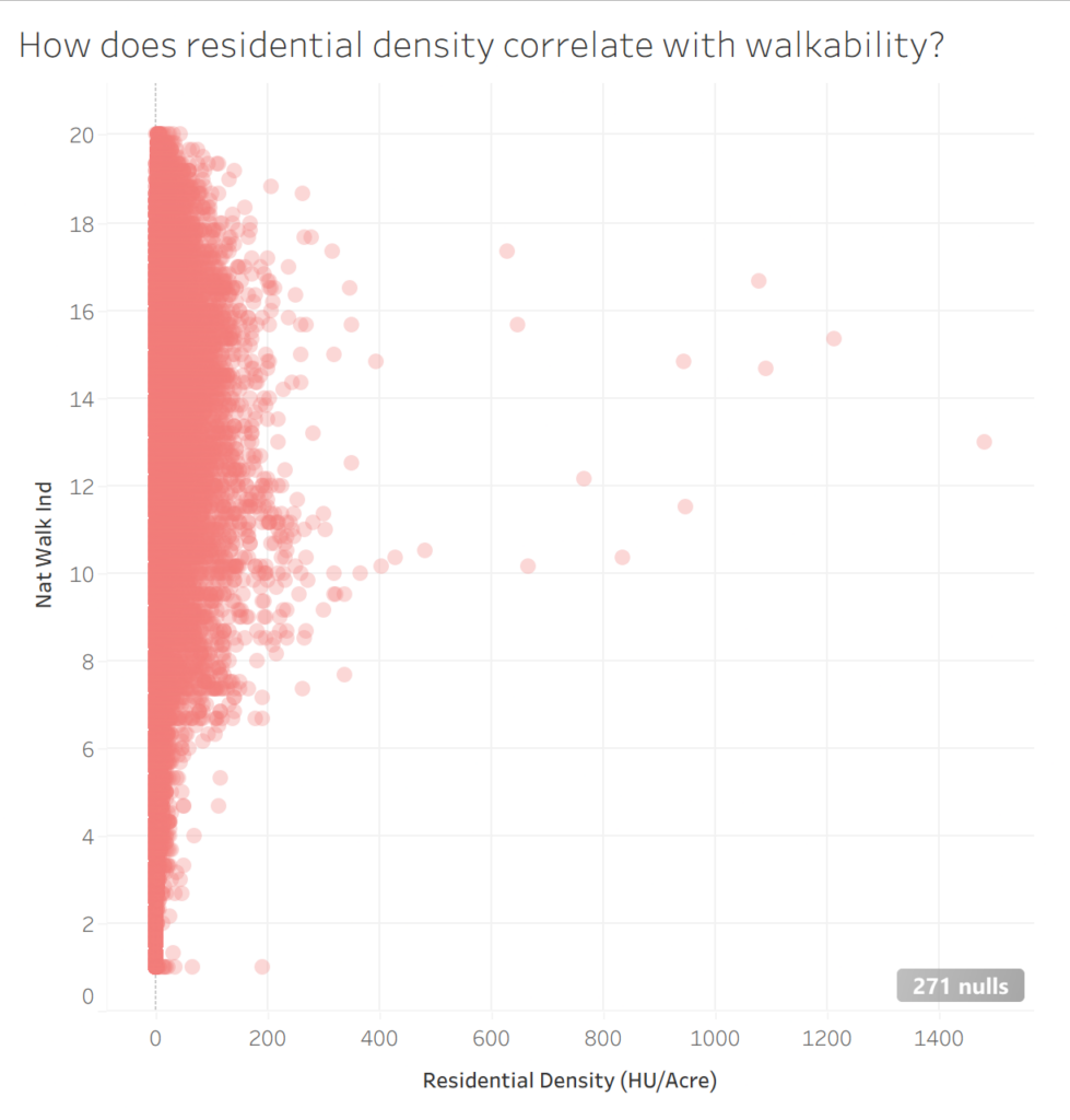
Figure 4 – Residential Density vs Walkability Index
However, after creating a scatter plot of housing units per acre (residential density) versus walkability index, we notice that, due to the presence of extreme outliers, it becomes difficult to notice any trends between those two variables. A majority of CBSAs considered by the below graph fall between 0 to 400 housing units per acre, with wildly fluctuating walkability. The CBSAs with greater residential density do tend to have higher walkability, but this graph tells us that residential density has far from a direct correlation on walkability, and other factors are at play.
We then decided to examine whether a region’s diversity has any effect on its walkability. Car ownership serves as an important indicator of transportation dependence, since zero-car households have no choice but to rely on walking, public transportation, or other shared transportation options to get from point A to point B.
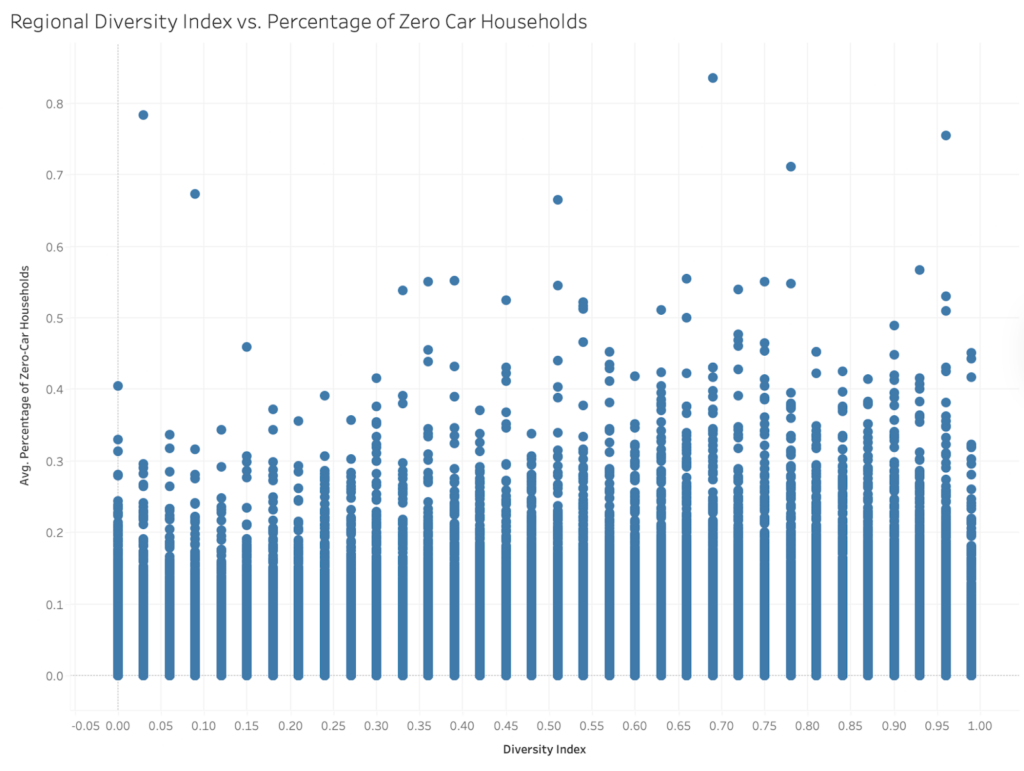
Figure 5 – Regional Diversity Index vs. Percentage of Zero Car Households
This graph shows that regions with higher diversity index values tend to have slightly higher percentages of zero-car households, with variation across individual areas. Thus, more diverse communities are oftentimes more dependent on non-automobile forms of transportation. This also lines up with the notion that larger cities, which have greater access to public transportation and nearby businesses, are more likely to be diverse than rural areas.
Lastly, to get a better understanding of walkability within California, we created a mapped visualization of walkability against low-wage worker concentrations.
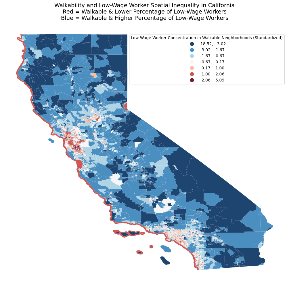
Figure 6 – Walkability and Low-Wage Worker Spatial Inequality in California
The map showcases the spatial relationship between high walkability neighborhoods and the percentage of low-income workers in those neighborhoods across each block group in California, which highlights the deep divide between the high percentage of wealthy individuals living on the coast and the other areas of the state. The socioeconomic spatial patterns are represented by a divergent “Natural Breaks” color scheme, where the deep red represents high-walkability areas with lower percentages of low-wage workers, whereas the deep blue represents high-walkability areas with higher percentages of low-wage workers, and white represents the transition zone between those two extremes as classified by the Jenks Natural Breaks method. From a geographical perspective, the intense red clusters are located around the coast regions, such as the San Francisco Bay Area and West Los Angeles, while the deep blue clusters tend to be in the Central Valley, rural areas, and urban peripheries. This visualization is significant to the project because it touches upon the concept of infrastructure exclusion, where the benefits that walkable urbanism has are decoupled from the workers who could rely on it the most due to differences in socioeconomic status. Thus, this map can be useful in the project in determining where the discrepancies between the locations of walkable neighborhoods and the locations of where the people who can benefit from it the most (low-income workers in urban areas across every block group) arise.
Throughout these data visualizations, we were able to get a better understanding of how walkability is dispersed and evaluated across different areas of the United States. They support our argument that there is a divide in walkability throughout the United States where the most walkable areas are available where it is most expensive and most needed where it is least developed.
Conclusion
Ultimately, our analysis shows that walkability in the United States, in addition to being affected by urban design, is also a reflection of deeper socioeconomic inequalities. While higher walkability is generally associated with denser, well-served metropolitan areas with access to jobs and public transit, these benefits are unevenly distributed across communities within these metropolitan areas. Our findings, supported by both the literature and the EPA Smart Location Database, demonstrate that both race and income significantly shape who has access to walkable environments. In many cases, the communities which would benefit most from increased walkability, particularly lower-income Black neighborhoods, are those with the least access to it, highlighting a clear disparity between these communities’ needs and the infrastructure to support them. Moreover, factors such as crime rates, air pollution, and race-based residential segregation further complicate the otherwise direct correlation between walkability and quality of life. Overall, we show that walkability is a socially constructed attribute of American communities, influenced by both policy decisions and systemic inequities. Addressing these disparities is essential for creating more equitable, healthy, and accessible urban environments.